Save 50% on a 3-month Digiday+ membership. Ends Dec 5.
The X Factor: What the new iPhone could do for mobile app and ad UX

Last week, Apple celebrated the iPhone’s 10th birthday by debuting its newest incarnation, the iPhone X. The X’s new edge-to-edge screen is a mobile developer’s dream: No longer is it a phone that can play media; it’s now definitively a media platform that happens to include a phone.
In 2007, consumers vastly underutilized the iPhone’s capabilities. Now, consumers stretch it to its limits, expecting immediate, flawless mobile experiences that incorporate beautiful design, intuitive navigation, and immersive media. Not to mention swift load times.
To ensure those expectations are met, we’ve put together a list of mobile UX faux pas we see in app design and advertising, their fixes and how the latest Apple iteration might impact mobile design.
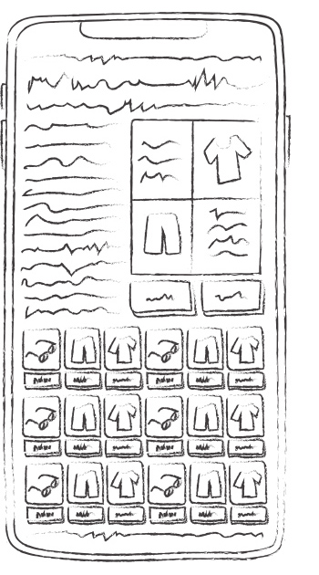
The Faux Pas: Too much information
“Every pixel is precious on a phone,” said Jason Hart, creative director at interactive agency Fluid. And when designers try to fit too much on a screen, they downsize buttons and fonts. “That leads to fat finger syndrome. You mean to tap one button, you accidentally hit another,” said Doug Manson, VP of creative for the mobile ad platform AdColony.
Ad position: web_incontent_pos1
The Fix: Tiles and testing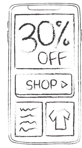
Mobile designers employ features that give information room to breathe. Tiles, for example, combine images, text and ample white space. “It allows the user to quickly judge where they want to go,” Manson said. Meanwhile, expandable menus allow designers to flight out information judiciously.
And while OS systems offer guidelines—Apple suggests that controls measure 44 points by 44 points, for example—successful mobile layouts rely on copious testing, said Hannah Ekman, a UX designer at Ceros. As a result of testing their mobile work in real time, Ceros developed a list of mobile UX best practices, including this one: Copy smaller than 20 pixels is too hard to read or click.
Will the X help? Yes, the iPhone X’s larger 5.8-inch OLED screen will give designers more room. But don’t forget to test.
Ad position: web_incontent_pos2
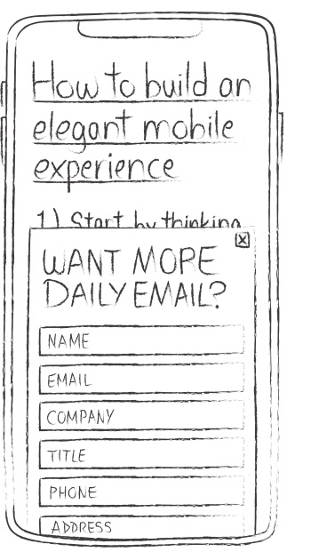 The Faux Pas: Coming on too strong
Every developer or advertiser wants the user to engage, but asking them to do too much too soon can hurt the experience. “Clicking through an on-boarding messaging system for eight clicks before you get into an app isn’t is the right way to do it,” said Hart.
The Fix: Choosing your moment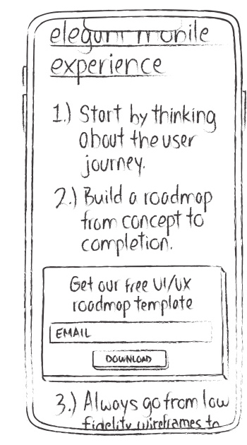
Thoughtful use of non-interruptive interstitials can soften the blow here. Take a cue from game designers: Rather than breaking into the action, identify a transitional point—like hitting a back button or scrolling to the end of an article—and offer chances to log in or watch an ad to access premium content there, Manson suggested.
Gradual onboarding also works here, said Hart. “You take a moment during their experience, during their time on your app and say, learn this one little thing, here’s what this button does. Did you know that if you click this, you get this?”
Will the X help? In the short-term, TBD. But the X’s new facial recognition technology could eventually be integrated into apps, allowing users to be “recognized” during transitional points, effectively logging themselves in.
 The Faux Pas: Desktop-native navigation
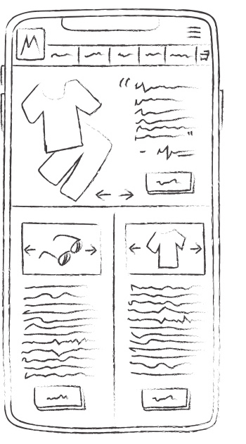
Consumers have had some iteration of the smartphone for 10 years, and in that time, there has arisen a new, ever-evolving set of mobile behaviors. Selfies, texting and swiping are de rigueur, but developers still hang on to archaic nav tools like desktop-native buttons and arrows.
The Fix: Mobile-native navigation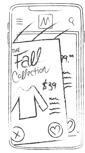
“Nowadays, people expect everything to function in the same way,” Manson noted. Whether you’re building a dating app or a mobile site, UX designers should incorporate the most prevalent mobile behavior.
“You expect to be able to swipe left, right, up and down,” said Manson. “I don’t know what’s going to happen when I tap on a button, but if I swipe, I’m pretty confident that because of my past experiences, I’m not going to leave the experience,” Mason said.
Will the X help? The X will have the same 3D touch screen that was introduced last year, and mobile users are now more accustomed to touching and pressing down for deeper access. As this behavior becomes more ubiquitous, UX developers could use it more to surface more information or drill down into experiences.
 The Faux Pas: Forgettable banners
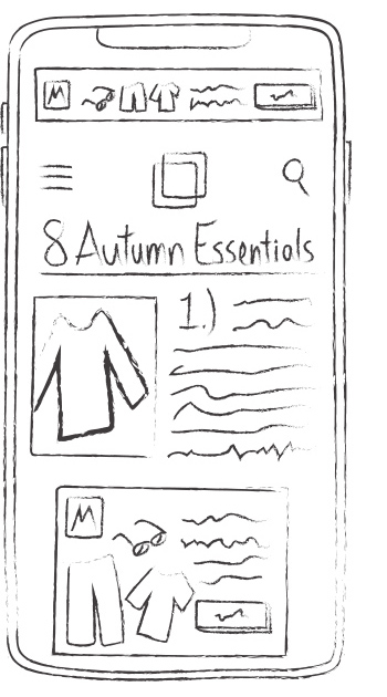
Banner ads, already poor UX on desktop, commit all of mobile UX’s cardinal sins—they roadblock users from content, employ archaic navigation and often try to squeeze too much into a single 320 x 50-pixel area. “The ‘buy now’ button: It’s gotta be pretty small because you need to get a tagline and logo in there,” said Manson.
The Fix: All of the above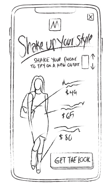
Ads, like the apps they’re served in, work best when they give users space, choose their moment and make the best use of the phone’s native features. Manson said edge-to-edge, rich media ads are the most natural fit for what is essentially a mobile media player.
And in dynamic apps, gamified ads, Easter eggs, and other details make the experience. “A part of that comes from the gaming world,” said Hart. “People have an expectation that everything is going to be fun… You can really lead people through a journey and have that journey be exciting,” Hart said.
Designing audiovisual ads that incorporate game functions like tilt and tap create an ad experience that excites consumers, rather than bores them, Manson said.
Will the X help? Almost certainly. Its A11 bionic chip is faster, the edge-to-edge screen allows for a more immersive experience and the longer battery life supports heavier use, so it’s optimized to support full-screen, dynamic and immersive ad units.
More from Digiday

What publishers are wishing for this holiday season: End AI scraping and determine AI-powered audience value
Publishers want a fair, structured, regulated AI environment and they also want to define what the next decade of audience metrics looks like.

Ulta, Best Buy and Adidas dominate AI holiday shopping mentions
The brands that are seeing the biggest boost from this shift in consumer behavior are some of the biggest retailers.
Ad position: web_bfu