Save 50% on a 3-month Digiday+ membership. Ends Dec 5.
By some accounting, nearly 183 billion emails are sent every day. If your inbox is anything like ours, it feels like a billion are addressed to you.
And yet, we still love email. It’s one of digital marketing’s most effective tools. Every day, teams of talented email marketers around the world manage to engage their audiences with more than just subject lines. Some campaigns are clever, some are funny, others are simply beautiful. The best manage to be everything at once.
To honor these often-unappreciated inbox artistes, we combed through the three million campaigns sent through our software to find the 100 best. Below, we present 1o of our favorites from this very crowded field.
Divvy
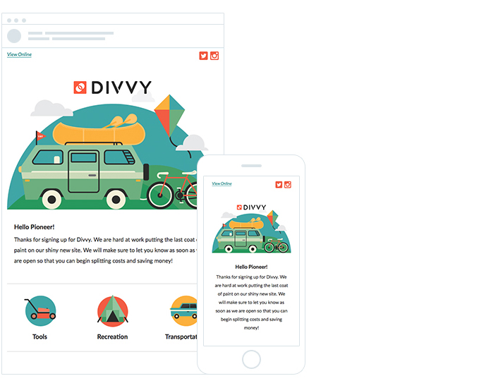
Designed by: Divvy
Subject: Welcome to Divvy
Why we like it: From the colors and graphic style, to the language and length — this email is fun and friendly. As intended, readers are welcomed into the Divvy community with open arms.
Ad position: web_incontent_pos1
Web Together
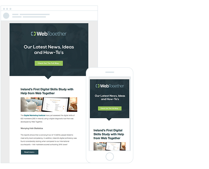
Designed by: Web Together
Subject: Ireland’s First Digital Skills Study with help from Web Together
Why we like it: Web Together put together one good-looking email. This on-brand design aligns with their own website, ensuring visual continuity from open to landing page and beyond.
Roller
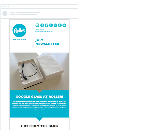
Designed by: Roller
Why we like it: The rounded edges of this typeface and circular brand give it a lighthearted feel, while the simple but elegant use of cyan brings liveliness to the campaign. It’s well-balanced and the arrows suggest the reader should scroll to see more.
BuzzFeed
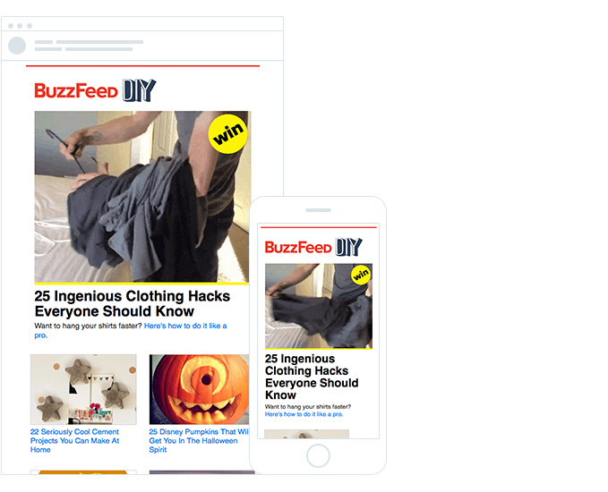
Designed by: BuzzFeed
Subject: Clothing Hacks You Really Should Know
Why we like it: This winning “DIY” features real tips and tricks, supported by copy that’s colloquial and engaging. The main delivery is supported by ancillary socially optimized content that keeps the focus where it should be: on the Buzzfeed brand. This email is dynamic, and nearly impossible to ignore.
Ad position: web_incontent_pos2
Webtype
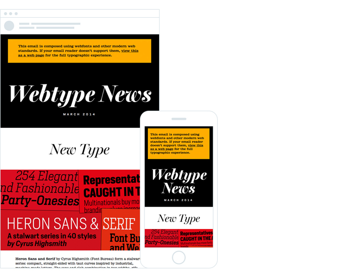
Designed by: Webtype
Subject: Webtype News, March 2014
Why we like it: The confidence of this design attracts attention, and the contrasting colors, images and interesting typefaces lend energy. In all, this is an remarkable email marketing piece on displays of any size.
Rip Curl
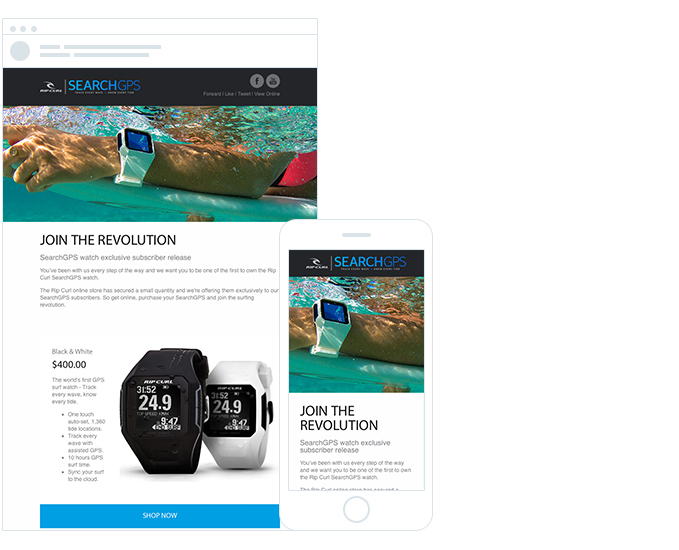
Designed by: Rip Curl
Subject: SearchGPS Avalaible – Buy the Watch
Why we like it: An outstanding example of leading with bold, eye-catching photos. The watch featured is perfectly placed; it remains front and center on the mobile version, which is broken up by easy-to-scan CTAs.
Gridbooks
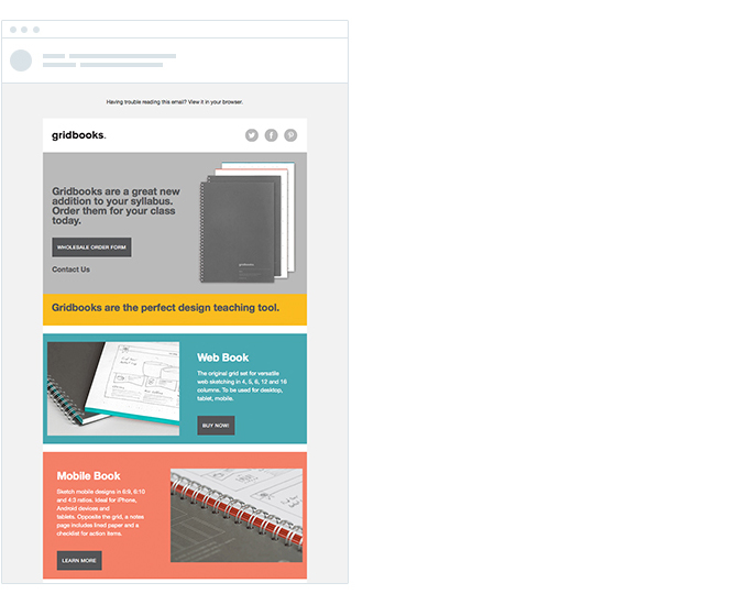
Designed by: Sajak & Farki
Subject: Complete Your Syllabus With Gridbooks
Why we like it: Ample white space and solid blocks of color ensure readers are not overwhelmed. Consistent CTA buttons guarantee readers know where to click next.
Ghost
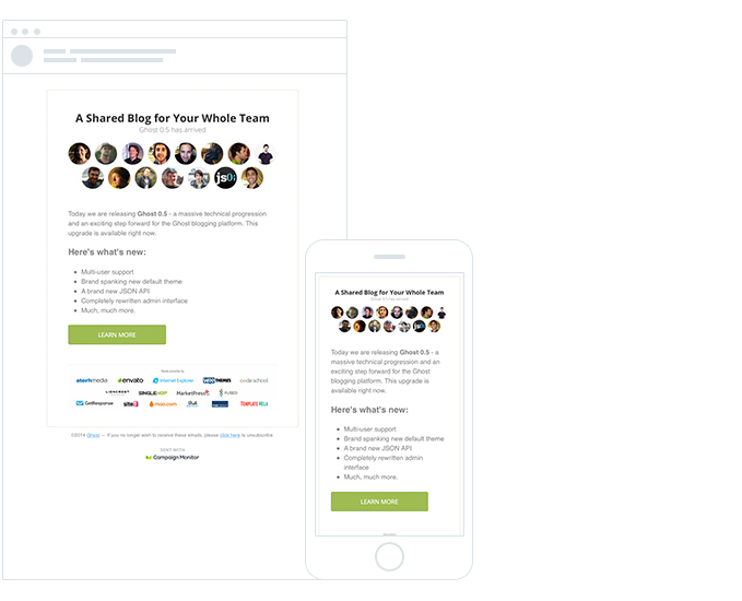
Designed by: Ghost
Subject: Ghost 0.5 Has Arrived: Grab Your Free Upgrade
Why we like it: The subject line is enticing, the dot points succinctly summarize the key benefits and the headshots keep it real. The CTA draws attention, and the “made possible” section demonstrates genuine appreciation and recognition, honoring the community. We can see why this email is a Top Performer.
Équilibre
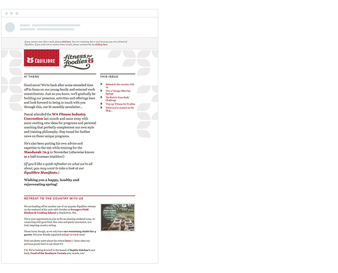
Designed by: Studio Bomba
Subject: Win a vintage bike for spring + retreat with us!
Why we like it: This text-heavy enewsletter is neatly broken up by divider lines and clear headings, but its best quality are the top right navigation links. Simple and informative, these links help readers jump directly to what they’re interested in, putting them in control.
InVision
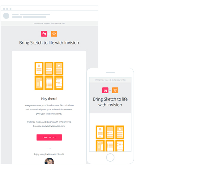
Designed by: InVision
Subject: We’re bringing prototyping to Sketch!
Why we like it: Personalizing the subject line did not win the audience over, but using dynamic content to personalize the email copy did. The animated gif brings this promotion to life, adding visual interest and, ultimately, generating engagement.
For 90 more award-winning email campaigns, click here for our complete Top 100 Best Email Campaigns of 2014.
More from Digiday

What publishers are wishing for this holiday season: End AI scraping and determine AI-powered audience value
Publishers want a fair, structured, regulated AI environment and they also want to define what the next decade of audience metrics looks like.

Ulta, Best Buy and Adidas dominate AI holiday shopping mentions
The brands that are seeing the biggest boost from this shift in consumer behavior are some of the biggest retailers.
Ad position: web_bfu