Save 50% on a 3-month Digiday+ membership. Ends Dec 5.
Comic Sans is a ‘misunderstood child’: What your font says about your personality
It’s not just what you write, it’s how you write it — and what font you use. We asked a bunch of top-notch designers to tell us what type of personality each font reminds them of. Pick which one works for you.
Gill Sans
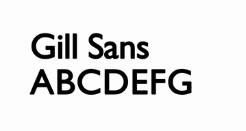 This sans-serif variety created in the 1920s was a favorite of the British Railways. It’s also said that Gill Sans helped define the entire genre of the humanist sans-serif family. It is a modern font but very accessible. That’s perhaps why Colin Murphy, senior designer at Huge, says it’s like a “boisterous mom down the street that hosts BBQs for the entire block.” She’s also a trendsetter: “Instead of serving the regular hamburger and hot dogs, she’s a little bit eccentric and serves glazed tofu and blood sausage.”
Baskerville
 This serif is a classic: designed in the mid-18th century, it is often called a “transitional” font because it sat in between the old-style and modern fonts of the period. Baskerville was Helvetica before Helvetica. It lived on the Lower East Side back when it was dangerous. That makes it kind of like a cool uncle, said Murphy, who owns worn-out leather luggage and is transitory himself, popping by a once every few years to talk “about his sommelier training and culinary adventures in Thailand over a game of Parcheesi,” he said.
Comic Sans
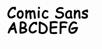 OK, breathe deep. Comic Sans is a divisive font. This casual sans-serif font is one of the youngest of the bunch — and also the one most likely to spin a normally thoughtful person into a white-hot rage. If you hate Comic Sans, blame Microsoft. Released in 1994, Comic Sans was intended to be a casual, friendly font. It turned into a symbol of deranged behavior. Where Murphy said it’s a “guy from high school you run into at Target who thinks you’re still friends but was only funny because he knew all of the lyrics to Weird Al’s ‘Bad Hair Day’ album.” Dyana Weissman, designer at the Font Bureau, is a Comic Sans defender of sorts. “He’s more like a misunderstood child,” she said. “His parents probably don’t pay him enough attention. He’s a little shy, and well-meaning teachers keep casting him as the lead in school plays, but that’s not what’s necessarily best for him.”
Jenna Sue/Rabiohead
Jenna Sue is a font that’s meant to mimic handwriting without actually being handwriting, making it the perfect fake-out. Jenna Sue is the Jenny from the block of fonts. It’s a favorite of Zazzle senior visual designer Michael Kuehl, who said it’s really the girl next door. Sue is a manic pixie dream girl — on paper, literally. You admire her free spirit. “She’s youthful and ecstatic for everything in life,” he said. “She enters the room and makes people smile. Every font longs for their more playful side to return.” His colleague, Nancy Ahn, an associate designer, is a fan of Rabiohead, which looks like Sue’s grown up sister who studied in London for a semester and comes back with a British accent. She calls that one “the obsessively organized artist” who collects stationary products and posts a lot of pictures of food and animals on Instagram. She also “can’t get enough boba tea.”
Ad position: web_incontent_pos1
Benton Modern Display
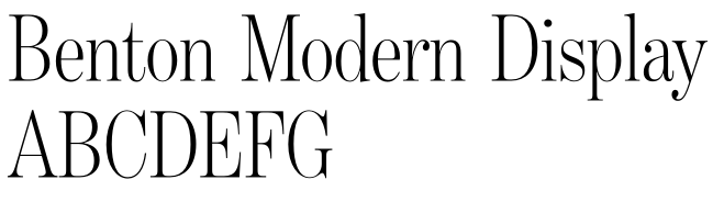 Benton Modern Display, created by the Font Bureau for the Boston Globe and the Detroit Free Press, draws on the design and proportions of Morris Fuller Benton’s “Century Expanded” font. It is, well, old school. Think of the family grandparent who has been through it all and remained dignified. Recommended for newspaper and magazine use, this font has old-world charm with a modern twist. “She might have been a cockney flower girl at one point, or a struggling singer in Paris. So I see she has a few sharp edges, but they’re charming,” said Weissman.
Farnham
 Farnham, which is also recommended for corporate use as well as in newspapers and magazines, is a Font Bureau typeface that is deceptively simple. Modeled on the work of German punchcutter Johann Fleischman, Farnham looks simple at first and gets complicated when you see unique characteristics. It is a serif, which conveys seriousness, accentuated by its readability. Weissman likened Farnham to a populist president. “He’s great in a wide variety of situations, which make him perfect for politics,” she said. “Very diplomatic and always fitting in. He gets the job done and is elected to both terms easily.”
Ad position: web_incontent_pos2
Futura
The Futura font family is a sans serif based on geometrical shapes that is used in so many places. It’s a thoroughly modern font, perfectly minimal. This is a font that has a loft apartment in Manhattan’s SoHo neighborhood and drinks its scotch neat. 
That’s what drew the eye of Devin Croda, an associate design director at Droga5. “I’ve found that many personality types can be expressed through typography, not only by the font itself but by the treatment applied to it.”
This is the kind of font that is equally at ease at a downtown rave as it is at Jean-Georges. Small tweaks of caps and boldness change its personality, as seen in the three versions of Futura above. The first is all caps, 1,000-point tracking and small text, which Croda says signifies a “spaceman. They’ve had their head in the stars since the summer of ‘69, and they’re still cutting edge.”The second is Future Bold in sentence case, with -80-point tracking and huge text. Croda calls this the “comedian,” and said this persona is clumsy, bumps into everyone and is “slapstick gold.” The third is Futura with mixed caps and a medium size. Croda calls this “the artist” and says this signifies a quiet independent” with a mind of its own.
More in Marketing
Testing Vendor Embed Script
Share this story Copy link Send this to your team LinkedIn X Facebook Email

Ulta, Best Buy and Adidas dominate AI holiday shopping mentions
The brands that are seeing the biggest boost from this shift in consumer behavior are some of the biggest retailers.

U.K. retailer Boots leads brand efforts to invest in ad creative’s data layer
For media dollars to make an impact, brands need ad creative that actually hits. More CMOs are investing in pre- and post-flight measurement.
Ad position: web_bfu