Save 50% on a 3-month Digiday+ membership. Ends Dec 5.
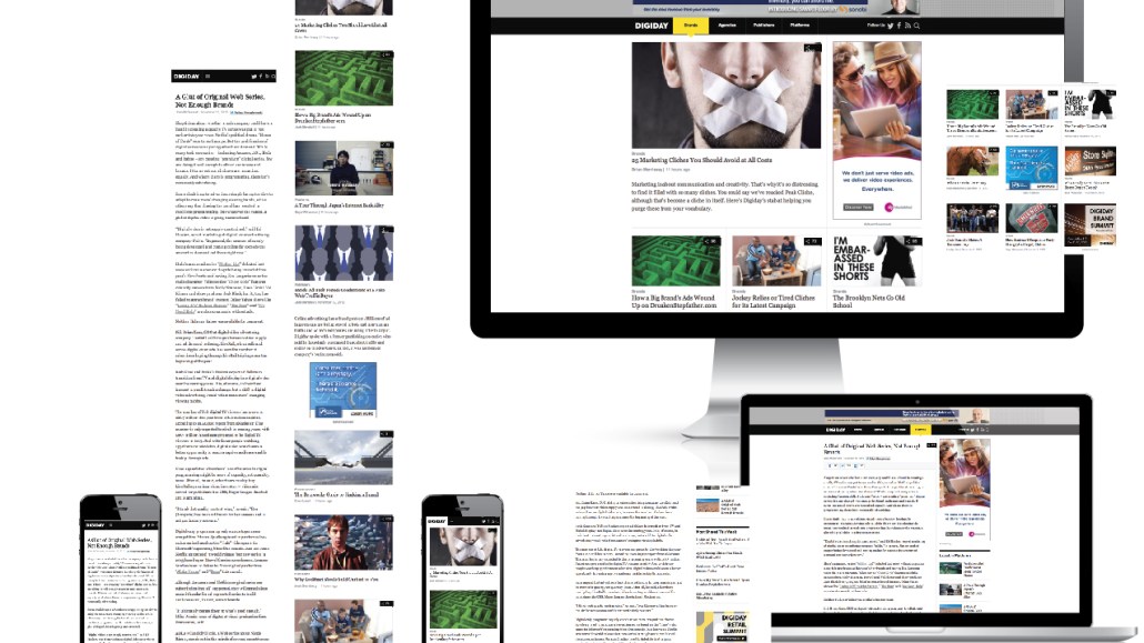
The state of publisher design today is a mixed bag. While there is no shortage of intrusive banner ads, tiny typefaces and cluttered article pages, there’s also plenty of good out there as well. With the rise of mobile reading, publishers are being forced to think carefully about how to design reading experiences that make sense for a new medium. And the clean reading experiences of sites like Medium and multimedia editorial features like Snowfall are also encouraging signs that editorial design has reached an inflection point.
“Everybody understands the value of design a lot more now than they did five years ago,” said Juliette Cezzar, director of communication design at The New School for Design and co-author of “Designing the Editorial Experience,” a new book about the state of publishing design.
Cezzar, along with co-author Sue Apfelbaum, said that while digital publishers still have a lot to learn, online editorial design is currently the best it’s ever been. The authors spoke with Digiday about the balance between design and advertising, publishers’ biggest design sins, and the problem with Medium’s über-clean take on the reading experience.
The common refrain is that designers serve the needs of the reader online while the publisher serves the needs of the advertiser. Have any publishers figured out that balance?
Apfelbaum: The first case study we go into in our book is BuzzFeed. When I read the site, I don’t notice a lot of things popping up in front of me. I know that there is a ton of branded content and I know things are sponsored, but they’re not interfering with my experience as a reader. So, yes, I think that there are some publishers who are being smart about how to merge these two things. You can have a great design that both fulfills the expectations of the reader and those of the publisher.
That’s one of the arguments for native advertising: While the business needs are driving that push, it’s also been great for the reader experience. Are native ads the answer?
Cezzar: I think we’re going to be experimenting with a lot of things. I don’t know what the correct direction is. One that keeps the publisher alive, one that ensures the greatest quality of content and the best reader experience. I don’t think we’ve landed yet on that balance. My guess is that it’s going to be a combination of a lot of different methods.
Digital publishing today still borrows a lot from print. Home pages are modeled after newspaper front pages, and publishers still assume that they have complete control over how people are reading their content. Is this a problem?
Cezzar: Everyone knows now that readers are coming in through the side, not front door. The structural metaphors from print have hindered progress in a lot of ways. Changing our minds about how we read online is really difficult. At the same time, people still have reading habits that we have to respect. You have to do away with some of the structural metaphors, but there are some of the procedural metaphors, like where articles begin and end, that are important to keep. That’s where a really good design comes in.

Ad position: web_incontent_pos1
What else are publishers doing wrong, design-wise?
Apfelbaum: A lot of sites are hiding their navigation bars in these hamburger menus and not providing any sort of overarching navigation. I think that that’s a mistake. I also hate light grey type on white backgrounds.
Sites like Medium are leading the clean Web design push with lots of white space, large fonts and big images. Is that good design or the lack of design?
Cezzar: Differentiation can be a problem there, and it’s even bigger when you’re talking about mobile, because branding on a mobile phone is 10 times harder than branding on a broadsheet newspaper. You’re dealing with a credit card-sized area to talk about what makes you different while still keeping things legible. I would say typography does a lot for this. Even if everything is clean and big, the form of the type will communicate a lot. That is the one thing that is used over and over again and it’s not an illustration.
It’s something that travels with the story regardless of how people find it.
Cezzar: Yes. It travels until it hits a different platform, and at that point the way things are written and organized and philosophy of the publication comes in. The publications that do well write stories in such a way that no matter where a story appears, you still recognize that voice.
Is that the key to having a strong publishing brand today? Having a voice that appears and resonates regardless of what the platform is?
Cezzar: Yes, but it also has to be flexible. If you’re successful, like Upworthy, people will imitate you, and then suddenly you’re a part of the stream again. The question then is how to you keep shifting and changing enough so that you also maintain your identity.
More in Media

What publishers are wishing for this holiday season: End AI scraping and determine AI-powered audience value
Publishers want a fair, structured, regulated AI environment and they also want to define what the next decade of audience metrics looks like.

Digiday+ Research Subscription Index 2025: Subscription strategies from Bloomberg, The New York Times, Vox and others
Digiday’s third annual Subscription Index examines and measures publishers’ subscription strategies to identify common approaches and key tactics among Bloomberg, The New York Times, Vox and others.

From lawsuits to lobbying: How publishers are fighting AI
We may be closing out 2025, but publishers aren’t retreating from the battle of AI search — some are escalating it, and they expect the fight to stretch deep into 2026.
Ad position: web_bfu