Save 50% on a 3-month Digiday+ membership. Ends Dec 5.
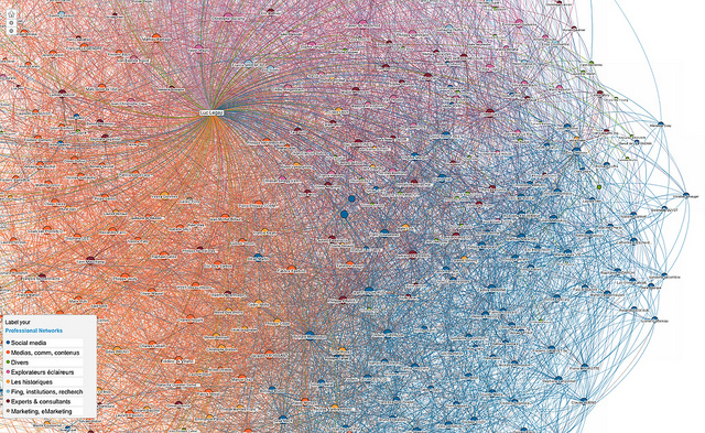
“Infographics” have become ever-present on the Web. But often the term “infographic” gets haphazardly slapped onto things that aren’t much more than a fancy bar chart. (Digiday has definitely been guilty of that in the past.) And now “data visualization” is the new hot label for data graphics. Here is another one of our handy flowcharts to help you answer a tough question: Is it a graph, infographic or data visualization?

More in Media

What publishers are wishing for this holiday season: End AI scraping and determine AI-powered audience value
Publishers want a fair, structured, regulated AI environment and they also want to define what the next decade of audience metrics looks like.

Digiday+ Research Subscription Index 2025: Subscription strategies from Bloomberg, The New York Times, Vox and others
Digiday’s third annual Subscription Index examines and measures publishers’ subscription strategies to identify common approaches and key tactics among Bloomberg, The New York Times, Vox and others.

From lawsuits to lobbying: How publishers are fighting AI
We may be closing out 2025, but publishers aren’t retreating from the battle of AI search — some are escalating it, and they expect the fight to stretch deep into 2026.
Ad position: web_bfu