Save 50% on a 3-month Digiday+ membership. Ends Dec 5.

Publishers with progress bars on their article pages might be taking a step backward.
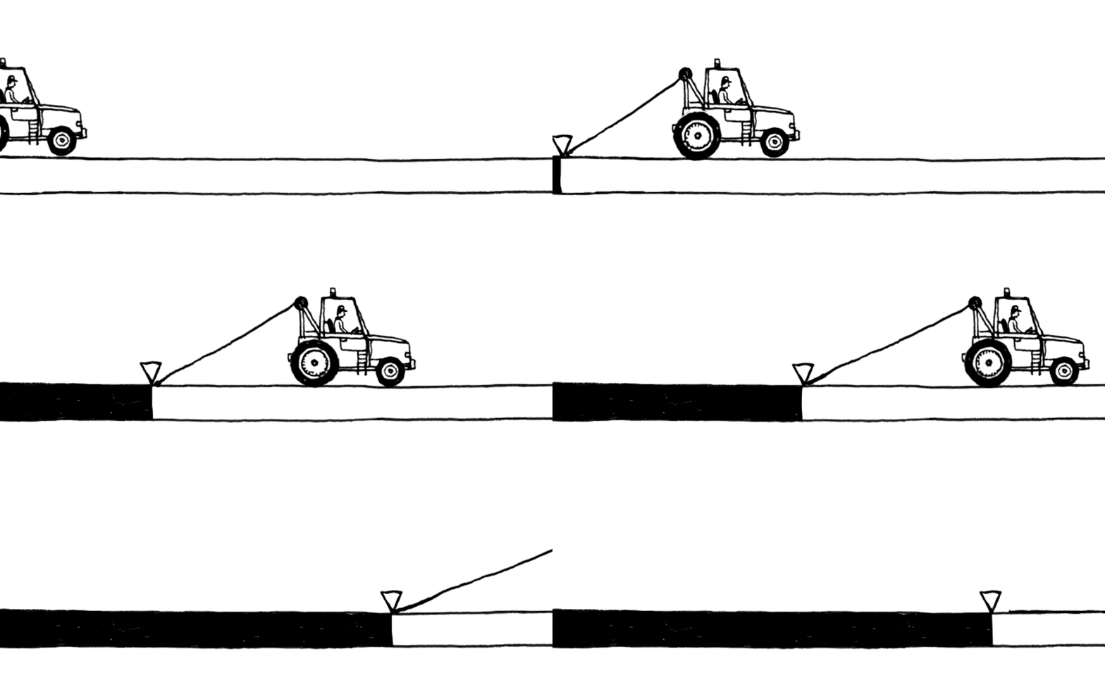
As sites push out more and more content of varying length, some are thinking up new ways to give readers a better idea of what they’re getting into. For some, such as Bloomberg and The Daily Beast, this thinking has led to their implementation of article progress bars, which let readers know in real time how much they’ve read — and how much farther they have to go.
The logic for the move is straightforward: By giving readers more information about how long a given article is, publishers put readers in the driver’s seat. But designers have their own opinions.
“It’s a neat feature, but it doesn’t make sense on blog posts or most digital content. Unless you use it for long-form stories, it just winds up being distracting,” said Kevin Kearney, CEO of Hard Candy Shell, adding that publishers should avoid using the feature across all of their articles. He said that Hard Candy Shell has “blacklisted” the feature and pushes back against clients who request it.
Designers say that the progress bar is similar to features such as the hamburger menu and infinite scroll, which publishers often adopt because they see them elsewhere, not because the features make sense within their strategy or for their audience.
Bloomberg, which added the progress bar as part of its January redesign, uses the feature for the majority of its articles, including its shorter news stories and longer features, on both desktop and mobile. It has also incorporated it into a March feature about a Seattle tunnel drill, which featured an animated drill that progresses as readers scroll down. At the Daily Beast, the feature is used to help readers keep track of their progress as they move down the site’s continuous scroll.
Ad position: web_incontent_pos1
“The progress bar exists because we think that subtle hints that give users more context and control over how they experience our stories are a good thing,” said Bloomberg digital managing editor Michael Shane. “When I see it on our site or on others, I feel more empowered and have a better grasp over how much time I need to complete a story.”
The New Republic turned heads when it added the feature as part of its 2013 redesign, but it has since been scrapped. The New Republic declined request for comment on about why it dropped the feature. But Kearney, who helped design that iteration of The New Republic, said the move came as the site shifted its focus away from long stories to shorter ones.
Charming Robot CEO Dan Maccarone, who called the progress bar “gimmicky” and “distracting,” said that the progress bar is also a product of publishers overthinking the reading experience. A better solution, he said, is the Medium approach: Tell readers exactly how long it will take them to read articles.
“I like that idea of having my expectations set before I click. To me, that’s more valuable than showing me my progress as I’m going though the article,” he said.
More in Media

What publishers are wishing for this holiday season: End AI scraping and determine AI-powered audience value
Publishers want a fair, structured, regulated AI environment and they also want to define what the next decade of audience metrics looks like.

Digiday+ Research Subscription Index 2025: Subscription strategies from Bloomberg, The New York Times, Vox and others
Digiday’s third annual Subscription Index examines and measures publishers’ subscription strategies to identify common approaches and key tactics among Bloomberg, The New York Times, Vox and others.

From lawsuits to lobbying: How publishers are fighting AI
We may be closing out 2025, but publishers aren’t retreating from the battle of AI search — some are escalating it, and they expect the fight to stretch deep into 2026.
Ad position: web_bfu
