Save 50% on a 3-month Digiday+ membership. Ends Dec 5.
The designer behind Twitter’s emoji suite: ‘Of course I love the smiley poop’

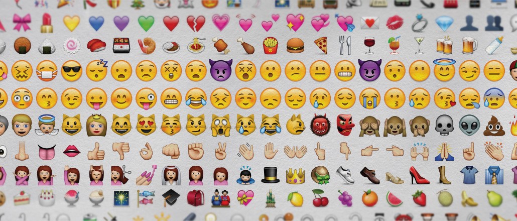
Emojis, like letters, come in different fonts — this is why a poop emoji looks like ![]() on your iPhone … and
on your iPhone … and ![]() in Gchat. The non-profit regulating body Unicode Consortium maintains and regulates them, but it doesn’t design or create any of these emoji.
in Gchat. The non-profit regulating body Unicode Consortium maintains and regulates them, but it doesn’t design or create any of these emoji.
That task is left up to the different companies — from Apple and Google, to Facebook to Twitter — which enlist designers to create their own renditions of the different emojis in Unicode’s giant database.
One such designer is Gedeon Maheux, the principal designer at Iconfactory, a software and graphic design company that most recently designed Twitter’s emoji suite and is currently working on another undisclosed one. We picked Maheux’s brain on everything that goes into designing these little characters.
Excerpts:
What is the process of designing emojis?
The process is basically taking into account what the client wants in terms of the style. If it is a new style, then the style has to be designed. Typically, we pick some sample icons from the entire suite that represent a wide range like smileys or people and objects, and translate them into that style. This way we narrow down styles until a style is approved. Once the style is approved, individual icons are sometimes sketched first and then rendered and worked on in Photoshop. When they’re ready, they’re put into the software code to represent the Unicode for it.
What was your approach in creating the suite for Twitter? How do you differentiate within narrow Unicode specifications?
Twitter already had a very good idea of what they wanted from the new suite of emoji. They had started to do some internal designs before outsourcing it, so those proved to be the initial rough blueprint for what followed. It didn’t take too long to get zeroed in on the styles and go ahead with production. They also pointed us at examples of other icons across the Web of what not to do (too cartoony, too realistic, etc.) and that proved really helpful. The style that Twitter chose was very simple. All the icons are just flat, shaded shapes.
What are some of your best practices for designing emojis?
You never know the resolution of the device or the platform that the user is going to be looking at the emoji on. So, they have to be designed in such a way that translates well both at large and small sizes.
Ad position: web_incontent_pos1
What do you feel about all these brands coming out with their own branded emojis?
A little while ago someone came out with a Seinfeld emoji, I think, and those are very misleading because they are not emojis. They’re just icons. You can’t type a Seinfeld emoji on your phone and have someone else see that icon. It’s not in the standard. So that’s really a lie, for anyone to say that they’ll just make a custom set of emoji. It’s a great way for them to cash in on the popularity of emojis, but it’s not really emojis. They’re just branding glyphs or icons that they happen to be promoting as emojis.
What is the hardest part about designing an emoji?
The hardest part is coming up with something that is unique to that particular suite but also familiar enough to be easily recognized by all the users who will see it. It’s a fine balancing act.
And the best part?
Knowing that millions of people will see and use what you design every day. It’s great to be a part of making so many people’s lives just a little bit easier, a little bit lighter.
Which ones are your favorite emojis?
Of course I love the smiley poop. I also like the sushi, the Bento box and the zucchini. The tractor and the race cars are really fun too. They’re super cute.
And which is the one emoji you wish existed that doesn’t, yet? How would you design it?
Well, for a long time I really really wanted a cool robot emoji. There were none in the standard, but the new 8 standard has included a new one called “Robot face,” so I’m looking forward to coming up with a design for that. I will probably base it off classic retro robots like Robby the Robot. It should be fun.
More in Media

What publishers are wishing for this holiday season: End AI scraping and determine AI-powered audience value
Publishers want a fair, structured, regulated AI environment and they also want to define what the next decade of audience metrics looks like.

Digiday+ Research Subscription Index 2025: Subscription strategies from Bloomberg, The New York Times, Vox and others
Digiday’s third annual Subscription Index examines and measures publishers’ subscription strategies to identify common approaches and key tactics among Bloomberg, The New York Times, Vox and others.

From lawsuits to lobbying: How publishers are fighting AI
We may be closing out 2025, but publishers aren’t retreating from the battle of AI search — some are escalating it, and they expect the fight to stretch deep into 2026.
Ad position: web_bfu