Save 50% on a 3-month Digiday+ membership. Ends Dec 5.
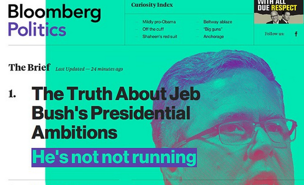
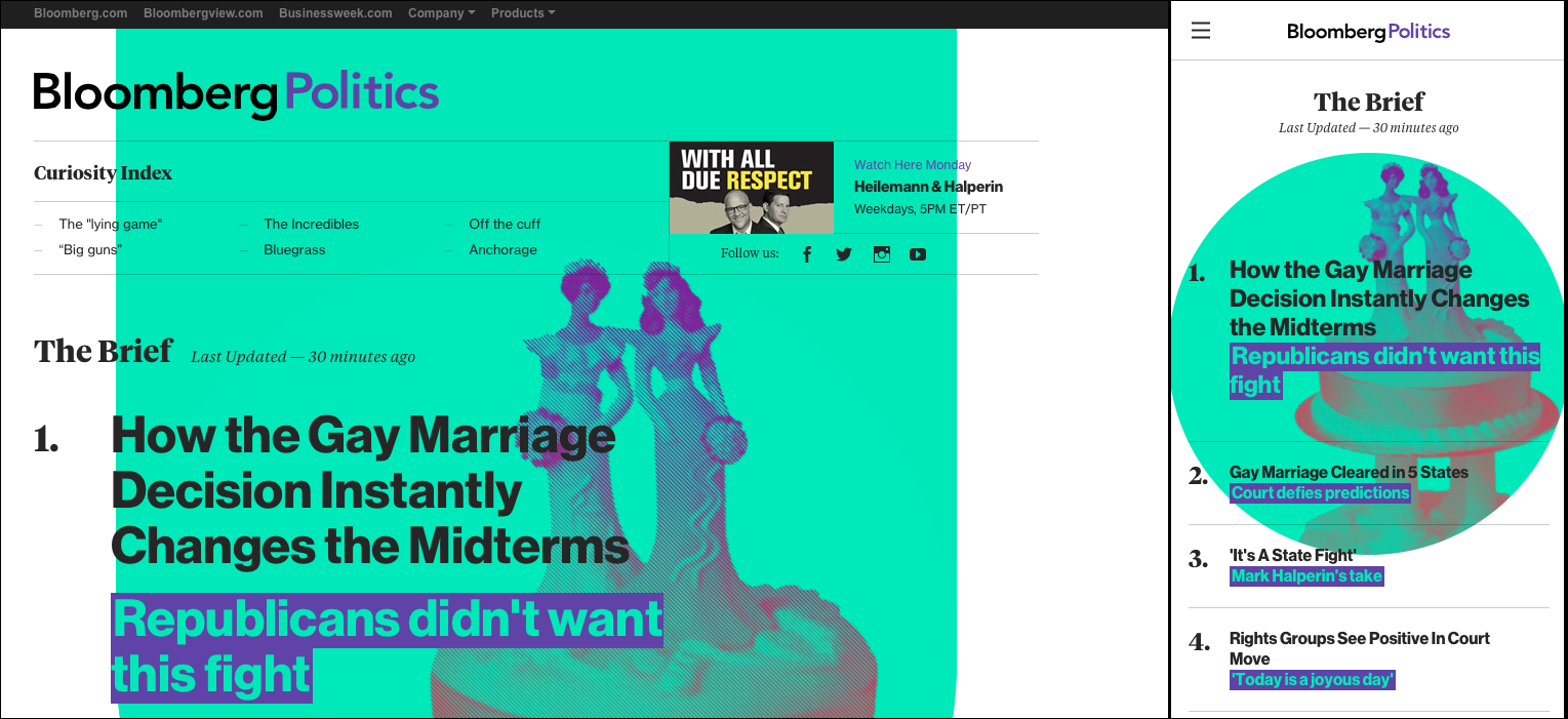
With the relaunch of Bloomberg Politics this week, Bloomberg is extending Businessweek’s polarizing design aesthetic further into the Web. With splashy homepage visuals, Businessweek-esque pull quotes and a continuous scrolling feature that mimics page turning, the new site feels less like a purely digital site and more like a digital version of the Businessweek print magazine itself.
And Bloomberg is not alone. Publishers across the Web are taking more digital-design cues from their print brethren. Yahoo, for example, calls its tech, food and travel sites “magazines,” and Flipboard also leans heavily on print cues by mimicking page-flipping and by letting readers curate their own custom magazines — covers and all. It’s an approach that Apple also took with its own Newsstand and iBooks apps, which also try to replicate the experience of reading off paper.
Designers, however, aren’t convinced that taking so many print cues is the most effective strategy. Bloomberg Businessweek’s bold, often off-kilter design layouts work well on print, but they’re much harder to pull off on the Web, where the design canvas is more limiting and where readers are trained to expect certain kinds of page structures and formats.
“I’m a big fan of what Richard Turley started at Bloomberg Businessweek, and its print aesthetic has been widely copied by other magazines,” said Joe Zeff, creative director at ScrollMotion. “On the screen, though, Bloomberg Politics has the potential to give its readers epileptic seizures.”
Even Turley himself is bearish on the idea that publishers can replicate the print world online. “I think perhaps a lot of digital design presumed it could replicate the magazine format. Consuming it on a desktop or tablet is fundamentally different. There’s a mistake to think you could replicate one with another,” he told Digiday in April. “It drives me mad.”
Still, it’s easy to understand why Bloomberg would try to extend its print brand and aesthetic to the Web. At a time when traffic is dominated by drive-by readers coming in via social channels like Facebook and Twitter, publishers are eager to leave an imprint as quickly and effectively as possible. Often this means large logos or even custom fonts. For Bloomberg Politics, it means flashy visuals and an overall design aesthetic that feels very different from what readers are used to.
Ad position: web_incontent_pos1
But that, in the end, might be a problem. “It’s understandable if you want to make a statement and make a site feel like your existing brand, but it’s egocentric to do that without thinking about how people are using your site,” said Dan Maccarone, CEO of Charming Robot.
In other words, while publishers may use splashy print-inspired designs to attract more readers, doing so could just as easily drive readers away. “There is enough cacophony outside of the browser frame. When you add more inside that frame, you risk scaring off your audience,” Zeff said.
Maccarone said that the problem with the new Bloomberg Politics site in particular is that it tries too hard to mimic the look of a magazine cover without recognizing that homepages and magazine covers serve very different purposes strategically. Whereas a magazine cover is designed to grab readers’ attention as they scan a crowded newsstand, homepages are designed to keep people around and push them to more content. “When you’re on homepage, the site has already gotten your attention. That job is done,” he said.
In the end, the best-designed sites aren’t those that are the most splashy, but those that consider and respond to how people actually read online. “Your content is going to sell your product, not your page design,” Maccarone said. “The new homepage might be cool when it launches, but it’s only cool for the first week. People often just stop coming.”
More in Media

What publishers are wishing for this holiday season: End AI scraping and determine AI-powered audience value
Publishers want a fair, structured, regulated AI environment and they also want to define what the next decade of audience metrics looks like.

Digiday+ Research Subscription Index 2025: Subscription strategies from Bloomberg, The New York Times, Vox and others
Digiday’s third annual Subscription Index examines and measures publishers’ subscription strategies to identify common approaches and key tactics among Bloomberg, The New York Times, Vox and others.

From lawsuits to lobbying: How publishers are fighting AI
We may be closing out 2025, but publishers aren’t retreating from the battle of AI search — some are escalating it, and they expect the fight to stretch deep into 2026.
Ad position: web_bfu