Save 50% on a 3-month Digiday+ membership. Ends Dec 5.

It’s barely been a few hours since Airbnb took the wraps off its new logo redesign, and it’s already the butt of all jokes. (Literally!)
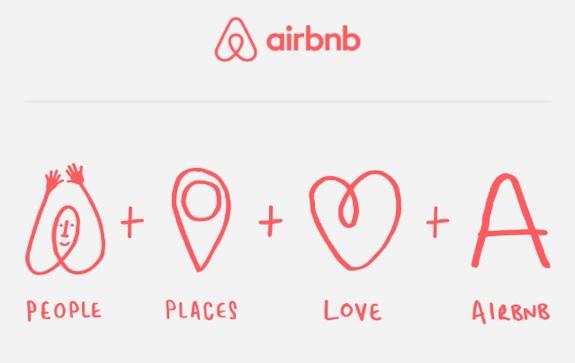
While this overhaul might have been a move to improve user functionality, if tweets are any indication the rebranding of the logo seems to have backfired. The new logo “Bélo,” representing belonging, is meant to be an uppercase ‘A’ merged with a heart and a place pin — but has been interpreted in a lot of unconventional ways (which may say more about our own dirty minds).
Here are a few of our favorite reactions to Airbnb’s revamped logo.
Let’s start with a glimpse at the creative process behind the logo.
The Thought Process Behind the new #airbnb logo pic.twitter.com/pUEps6e5Ik
— Shaun Pendergast (@ShaunPendy) July 16, 2014
Design UX/UI recast it in a way we can never unsee.
Not to talk crap about Airbnb’s new logo… but it had to be done. pic.twitter.com/1EZHZCTVth
— Design UX/UI (@DesignUXUI) July 16, 2014
Though designer Tad Carpenter put more of a scrotal spin on it.
Airbnb’s new logo is probably my favorite testicle based logo for sure. — Tad Carpenter (@TadCarpenter) July 16, 2014
Ad position: web_incontent_pos1
Others pointed out that the new logo looks awfully familiar.
The woman on the right is on the phone with her lawyer. pic.twitter.com/JnN1wvhcCa
— Mike Monteiro (@monteiro) July 16, 2014
Some people just went ahead and said what we’re all thinking.
Also I think it’s kind of awesome when logos like like sex organs. it’s fun! — Rick Webb (@RickWebb) July 16, 2014
Truly, logos are exciting.
Only a company founded by designers could come up with a logo that looks like every sexual organ in the human body. #startup #airbnb
Ad rendering preventing in staging
Ad position: web_incontent_pos2
— Jason Yu (@jhyu) July 16, 2014
Very exciting.
Somehow the new Airbnb logo looks like every single private part I can think of on either gender, all at once. That’s actually impressive. — Josh Johnson (@secondfret) July 16, 2014
Actually we hope the answer to this rhetorical question is “fewer than you’d think.”
How many people in AirBNB meetings didn’t tell their bosses the new logo looks like testicles? All of them, right? pic.twitter.com/2e9b1PpyeN — Kate Stayman-London (@_ksl) July 16, 2014
This actually explains everything.
GUYS this is all just a #sext from @Airbnb to NYC. #sweettalkers — courtney (@courteroy) July 16, 2014
The logo really was one big Rorschach Twitter test, in more ways than one.
Love the new Airbnb logo pic.twitter.com/Fdly6RJ9Lm
— Allie Goertz (@cossbysweater) July 16, 2014
We’re starting to wonder what the B’s stand for now.
‘Oh balls!’ – Airbnb’s Head of PR
— Darren McMahon (@DarrenMcMahon54) July 16, 2014
No, really.
The new @Airbnb logo looks like a weird butt. #belonganywhere — Joe Shoop (@joeshoop) July 16, 2014
To its credit, even Airbnb itself got in on the fun.
@joeshoop We prefer well-rounded. #BelongAnywhere
— Airbnb (@Airbnb) July 16, 2014
More in Marketing

Ulta, Best Buy and Adidas dominate AI holiday shopping mentions
The brands that are seeing the biggest boost from this shift in consumer behavior are some of the biggest retailers.

U.K. retailer Boots leads brand efforts to invest in ad creative’s data layer
For media dollars to make an impact, brands need ad creative that actually hits. More CMOs are investing in pre- and post-flight measurement.
Ad position: web_bfu